iOS Mobile App
Grapeful
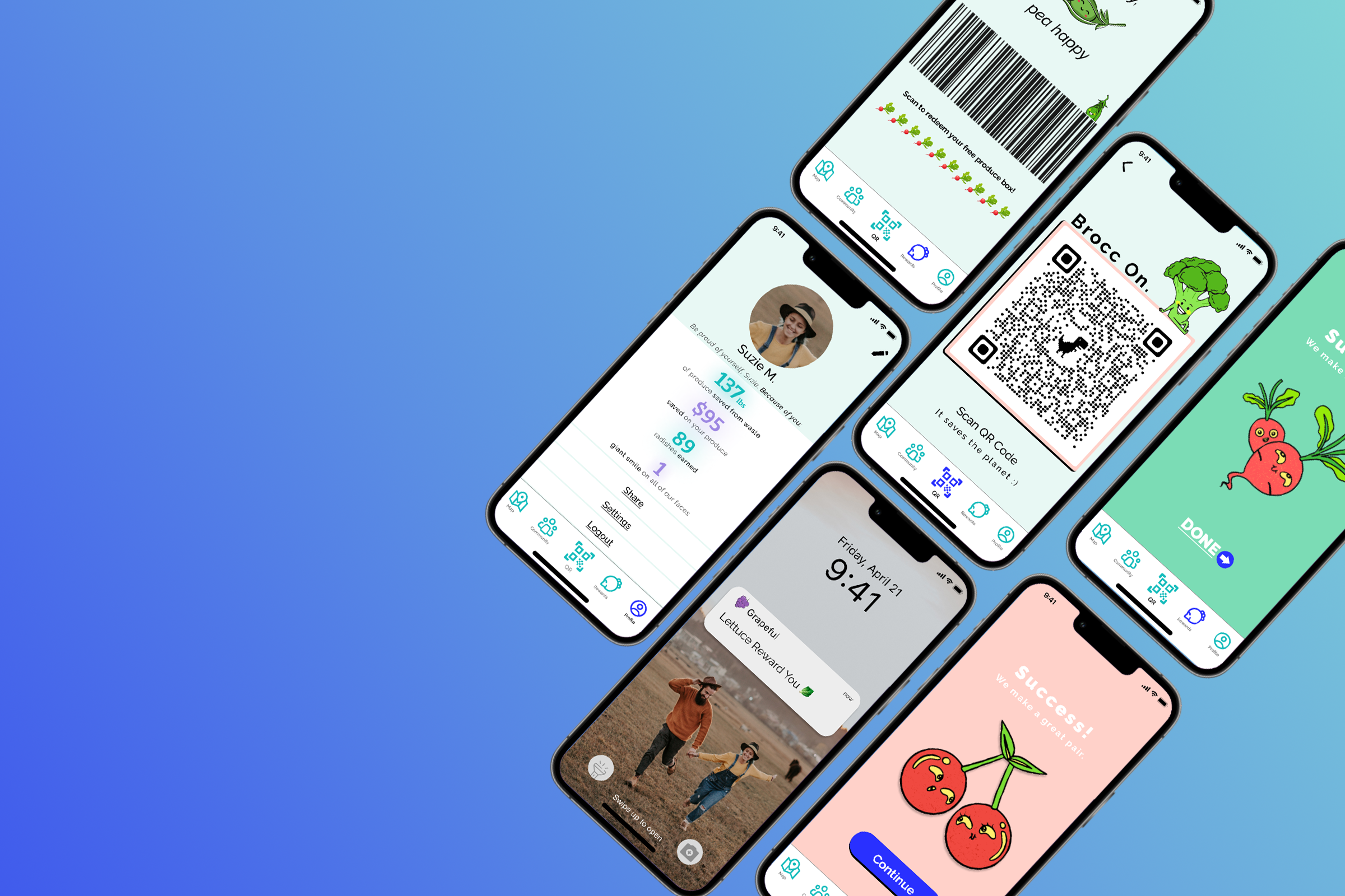
Grapeful is an app tailored to the waste-conscious consumer, designed to incentivize and empower consumers to purchase imperfect produce in order to contribute in reducing food wasted at grocery stores due to aesthetic imperfections.
PROJECT TIMELINE
Two Weeks
Academic | Group Project | Design Sprint
MY ROLE
UX Designer
TOOLS USED
Figma, Illustrator, Slack, Google Suite
PROJECT TYPE
2-Week Design Sprint
INTRODUCTION
This project constituted an academic group work, structured as a design sprint that unfolded over a span of two weeks. The primary goal of this project was to come up with a tentative digital solution to a given problem about Food Waste. My team was comprised of three members, and my responsibilities within the team was the project’s UX components, namely the research, sketching, and wireframe design aspects.
A global issue we face
PROBLEM SPACE
Nearly half of all fruit and vegetables produced globally are wasted each year and end up filling our land fills. In developed countries, a large quantity of produce is overlooked and thus, wasted due to cosmetic imperfections. There is a higher consumer standard of the appearance of food such as size, shape and color. It has been found that 30% of produce in North America is discarded because it is deemed “not pretty enough”.
RESEARCH
Primary & Secondary
As we wanted to know more about this imperfect side of food waste, our team conducted thorough research, guided by a fundamental question: “Why does imperfect produce often go unnoticed and overlooked in North America?” During our investigation, we uncovered some staggering statistics that shed light on the matter:
1.3 Billion
tones of food produced in the world for human consumption gets wasted every year
Appearance
OBJECTIVE
60 Millions
of fruits and veggies that are deemed “ugly” get wasted each year due to their appearance
~ 69%
of people routinely purchase their groceries from local grocery stores.
With newfound knowledge on food waste, we surveyed a group of regular grocery shoppers to understand their produce choices. From our pool of nine participants, we distilled the following key insights into their purchasing behaviors.
Visual appearance is very important to consumers.
Incentives
Consumers would buy imperfect produce if there were incentives.
Team Sprint Goal
Care
Consumers care but don’t know how to act about the issue of food waste.
The information and insights compiled from our research phase led us to our defined goal:
Decrease the amount of food that is wasted due to appearance in grocery stores - particularly in developed countries.
How Might We…
help waste-conscious consumers to purchase imperfect produce in order to decrease the amount of food that is wasted in grocery stores due to cosmetic imperfections?
Getting to know our target user
USER PERSONA
Introducing our user persona: Suzie Michaels, a 31 year-old mother residing in West Valley, Utah. Let’s delve into her story and learn more about her:
SKETCHES
Brainstorming stage
CLICK IMAGES TO ENLARGE
During this stage, our team was tasked with generating solutions on paper using the Crazy 8’s method, which consists of rapidly generating a variety of ideas within 8 individual squares on a sheet of paper. Here’s a summary of the results we obtained:
Following our paper brainstorming session, each team member created individual sketches. We then used the Heat Map process to collectively select the most promising concepts. The purple dots below represent features chosen to be included in the final prototype:
CLICK IMAGES TO ENLARGE
LOW-FIDELITY WIREFRAMES
From sketches to wireframes
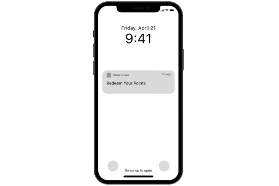
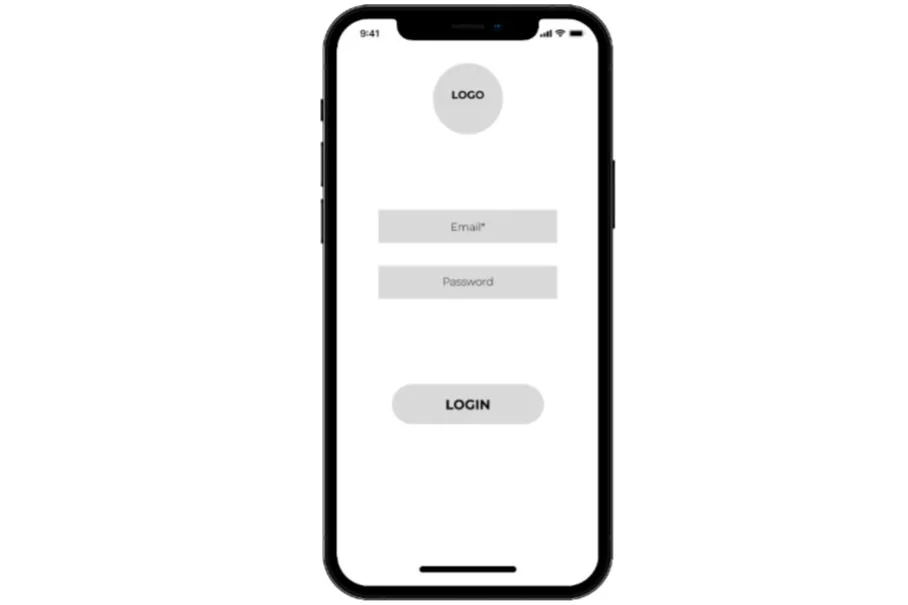
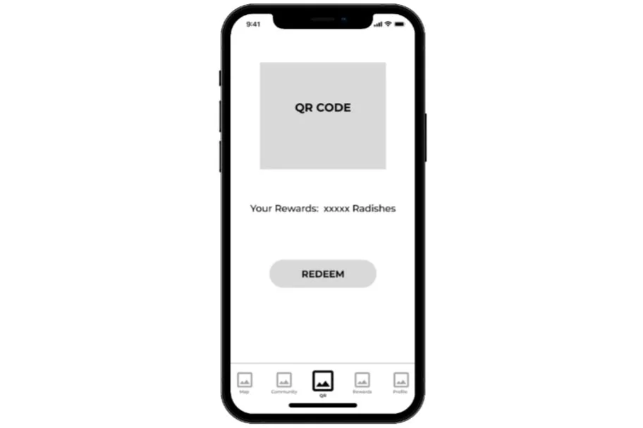
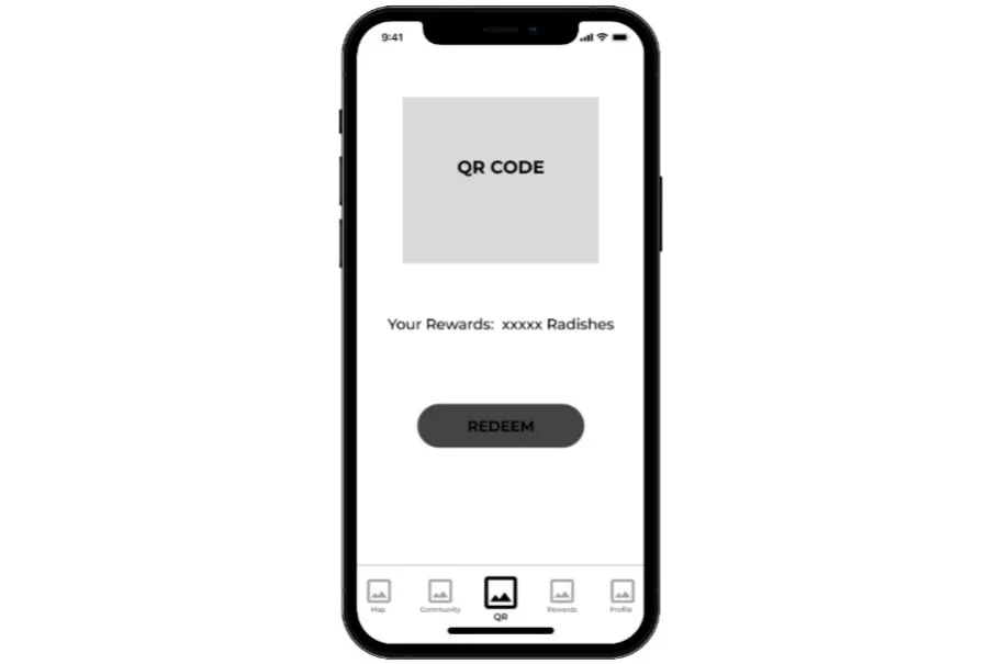
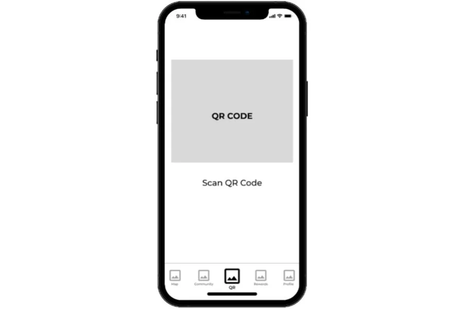
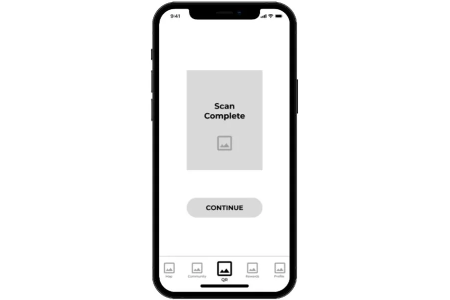
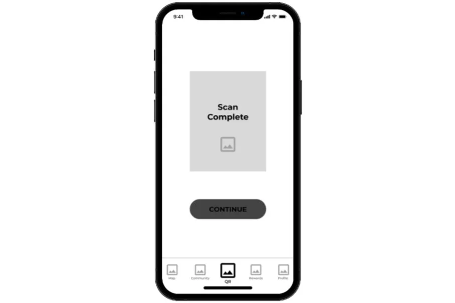
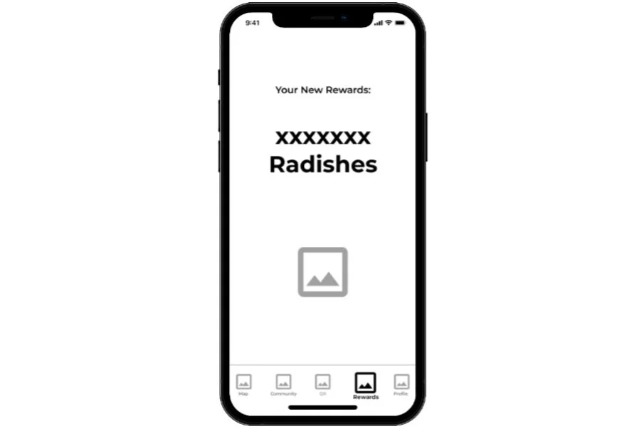
After a brainstorming stage that allowed us to explore various functionalities for the app, my team and I transitioned to the development of low-fidelity wireframes. These wireframes served as a foundational step in comprehending the app’s UX before proceeding to the interface design and ultimately creating the final prototype. Presented below are the wireframes:
HIGH-FI PROTOTYPE
Presenting Grapeful
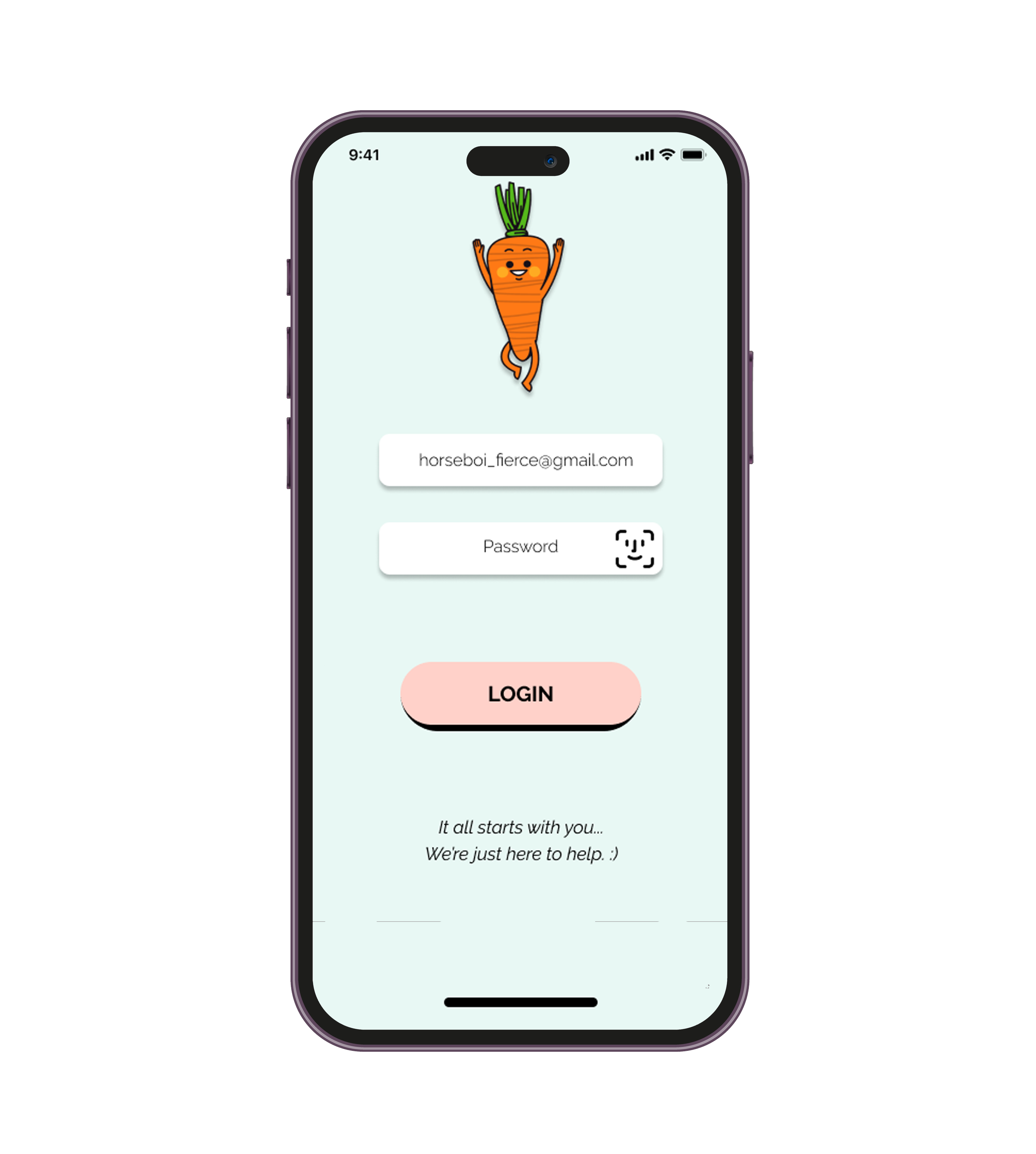
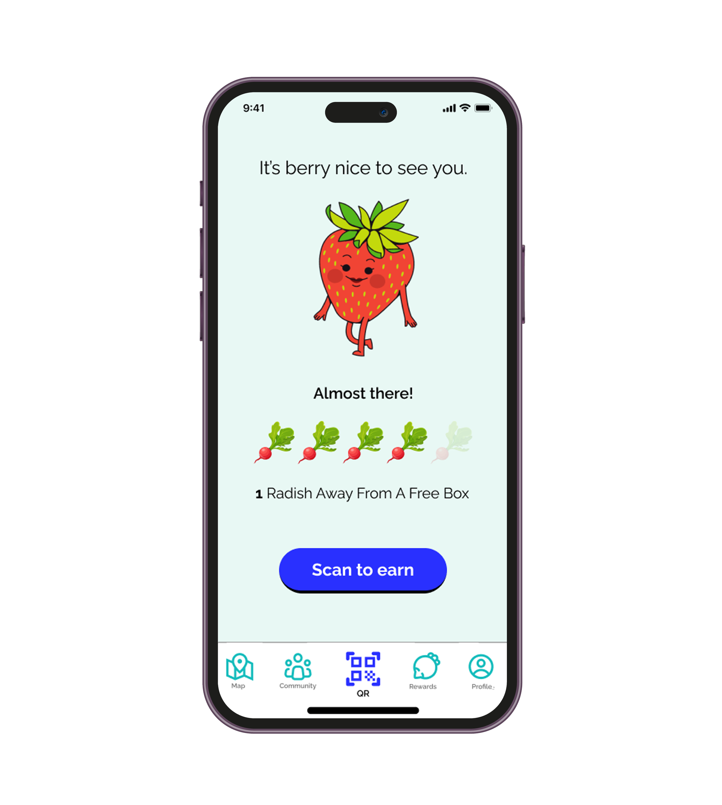
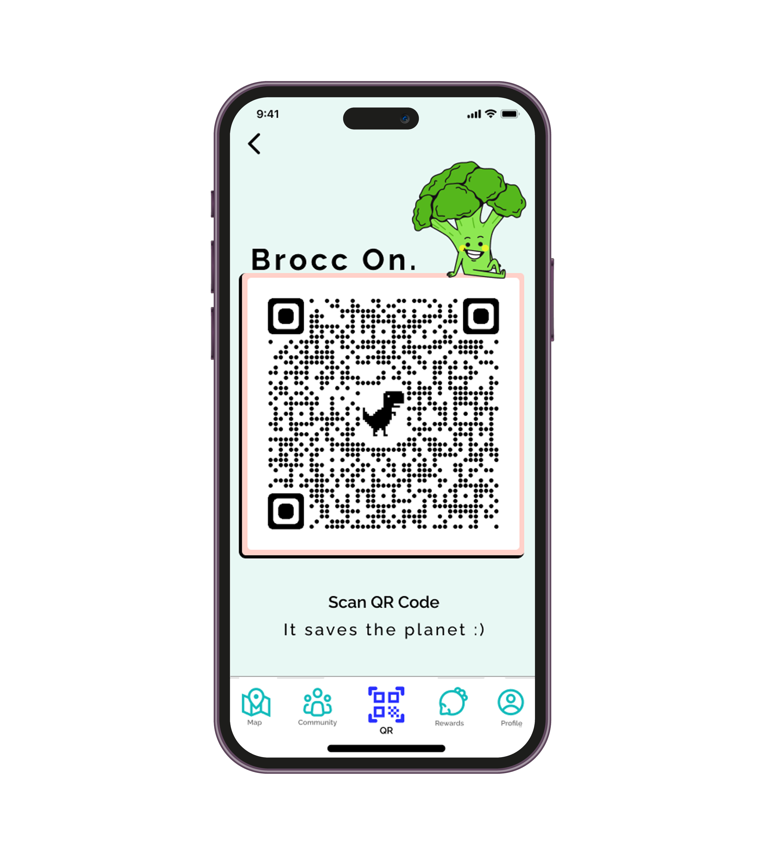
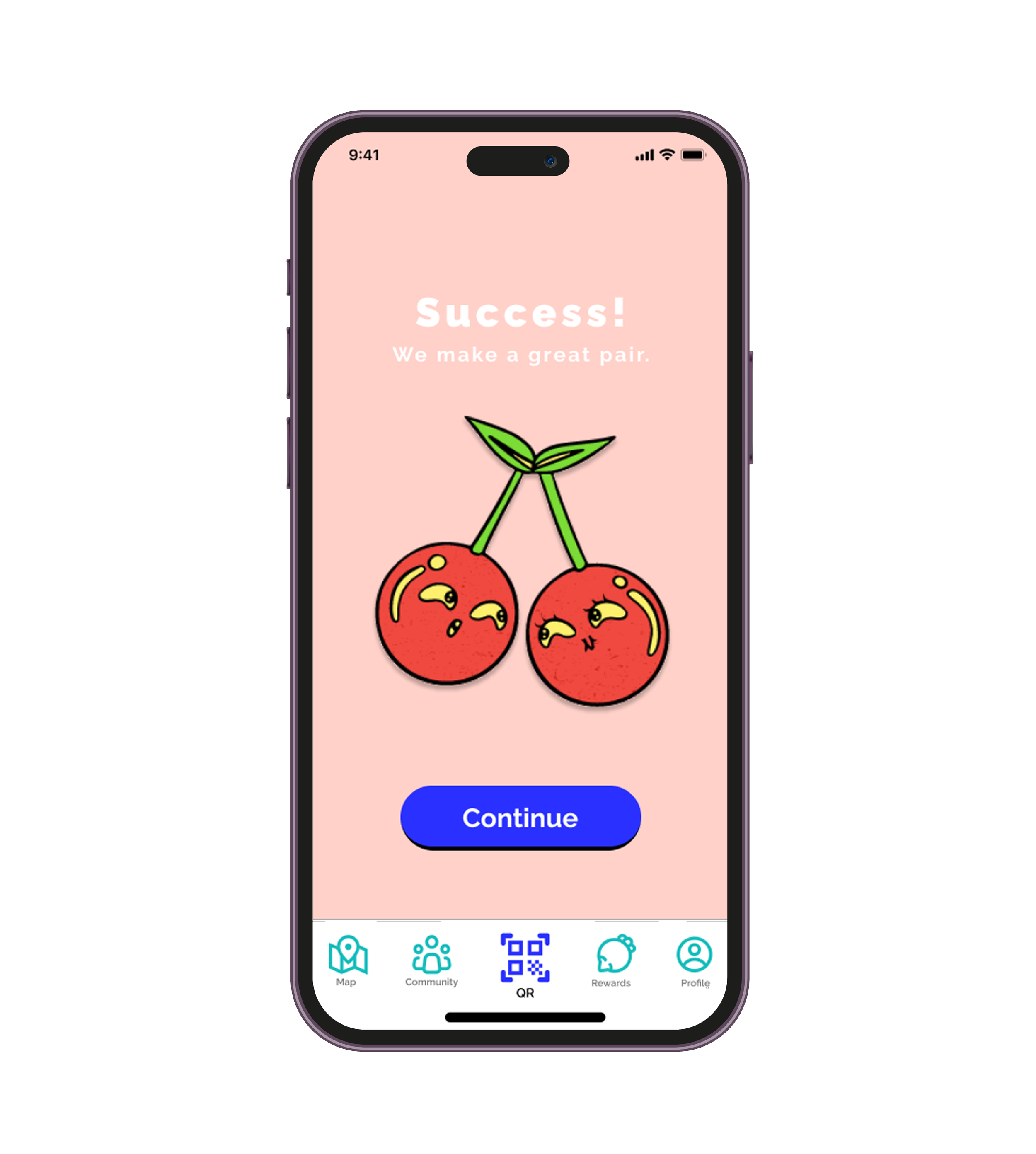
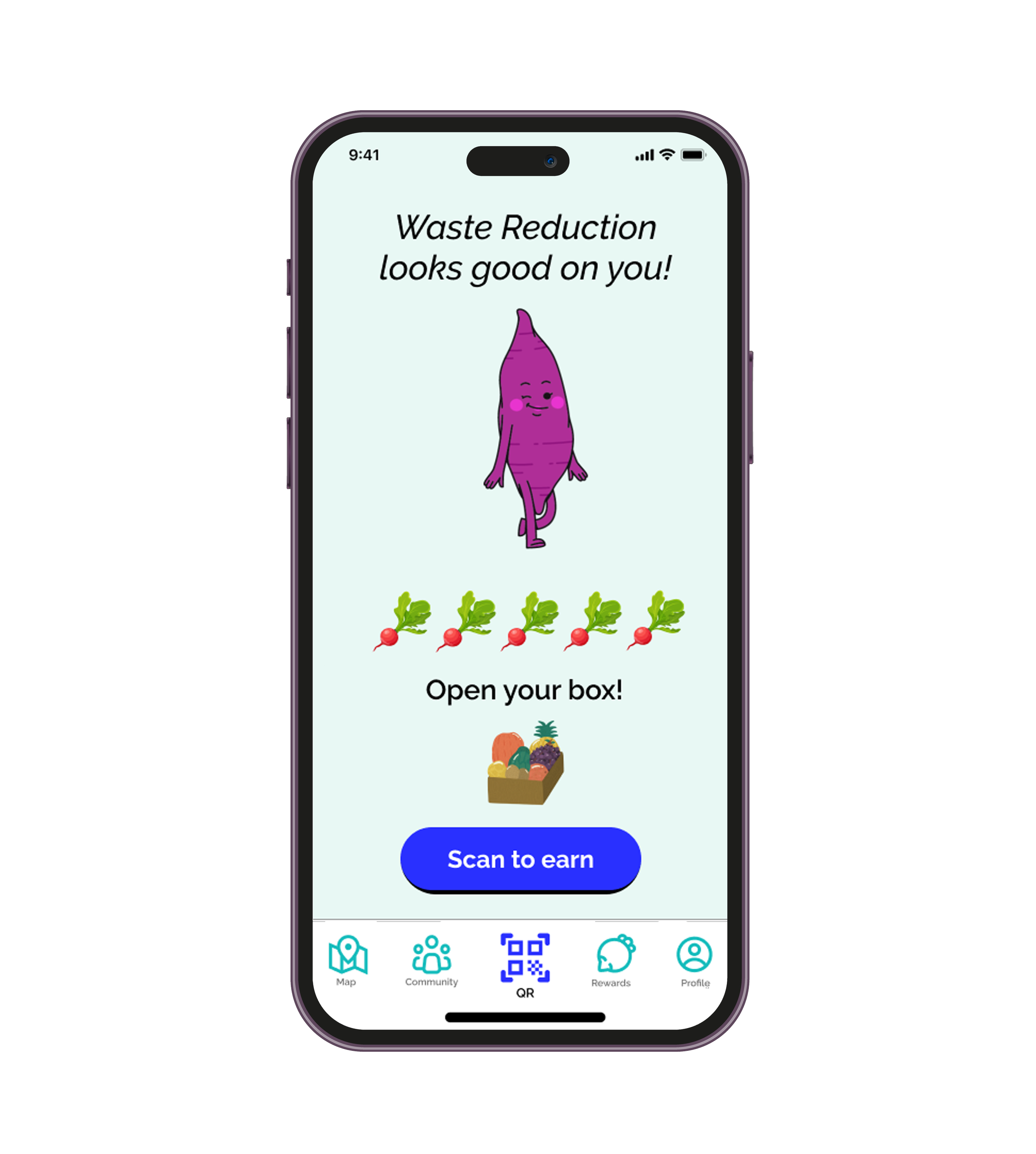
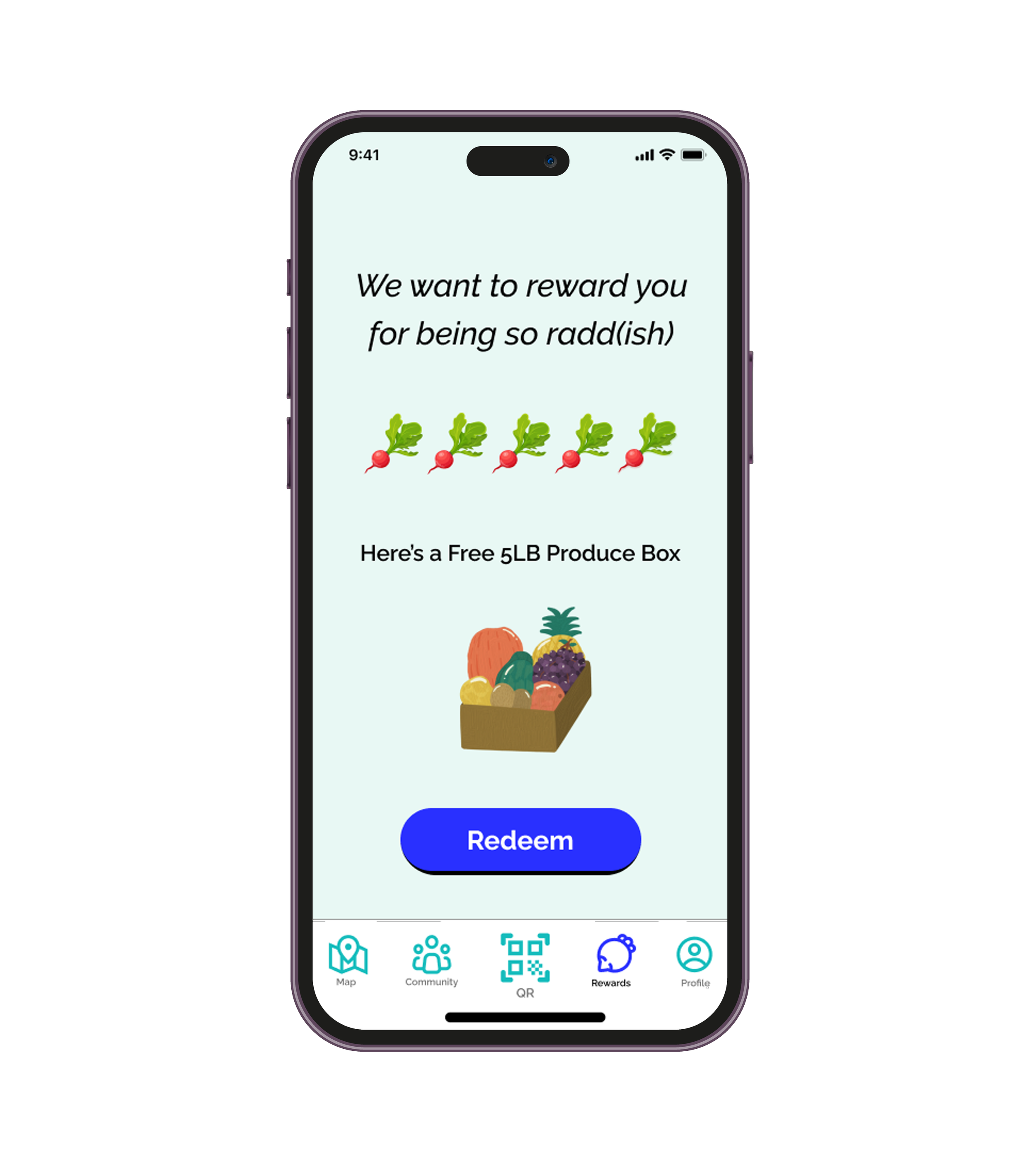
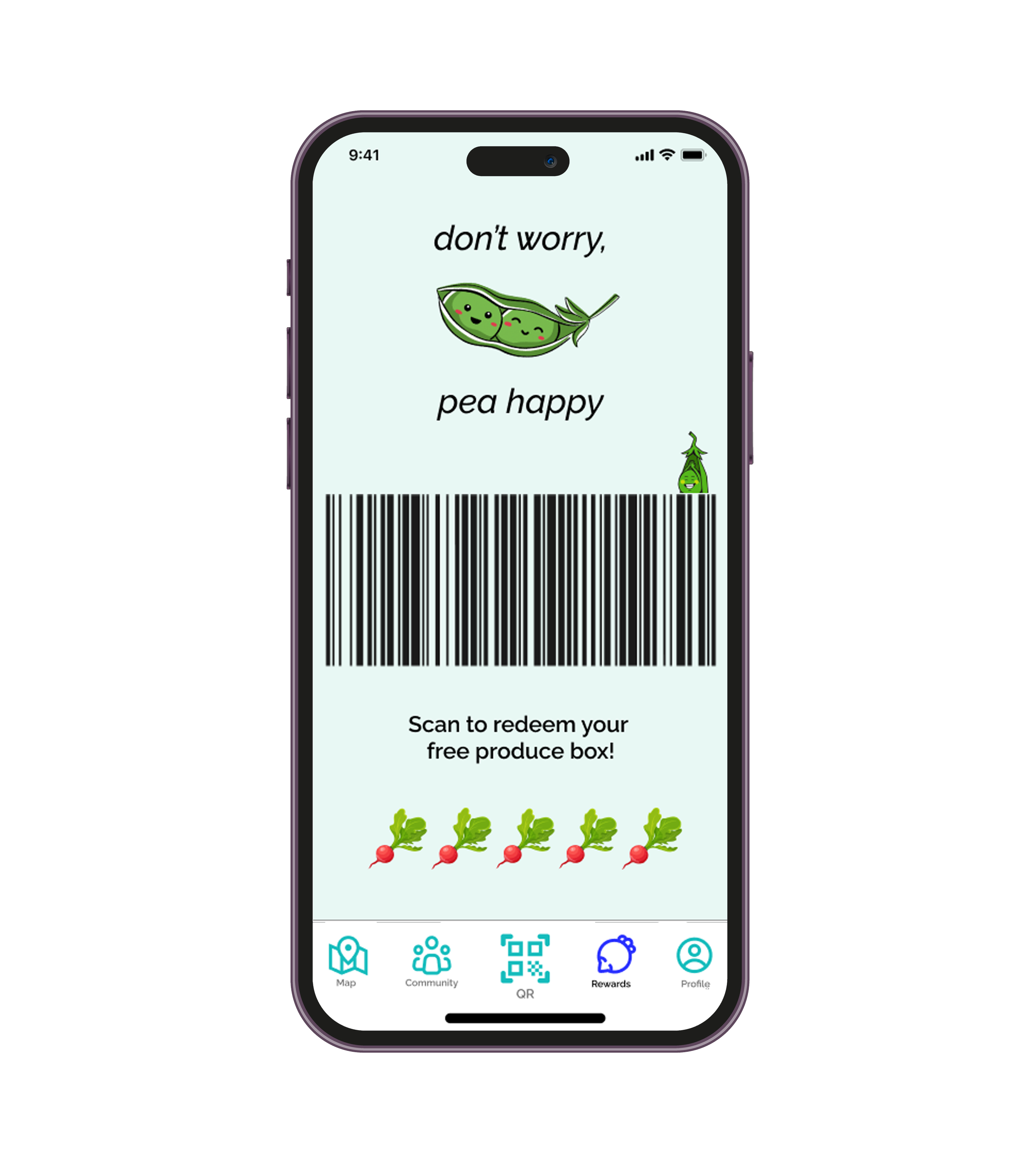
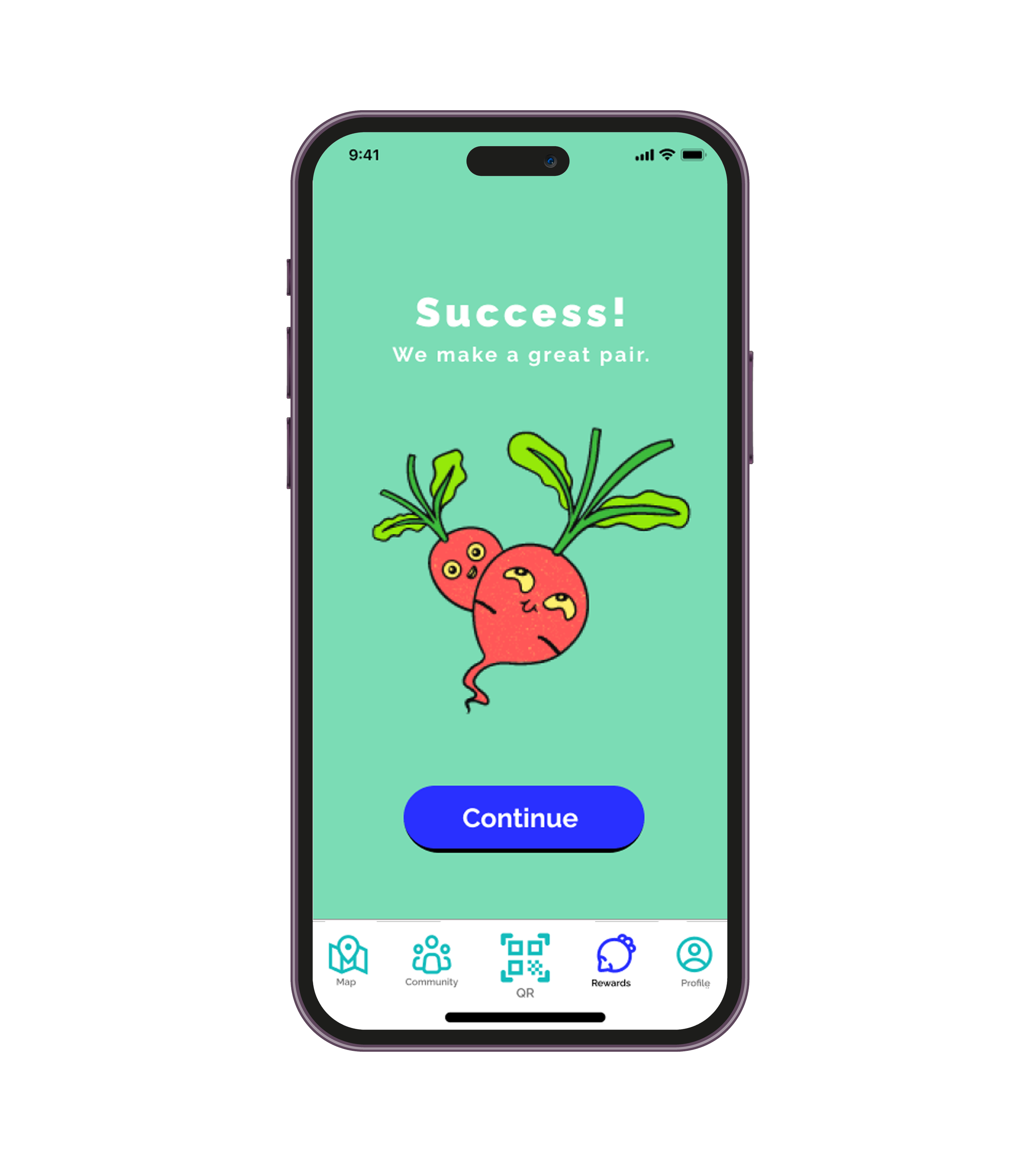
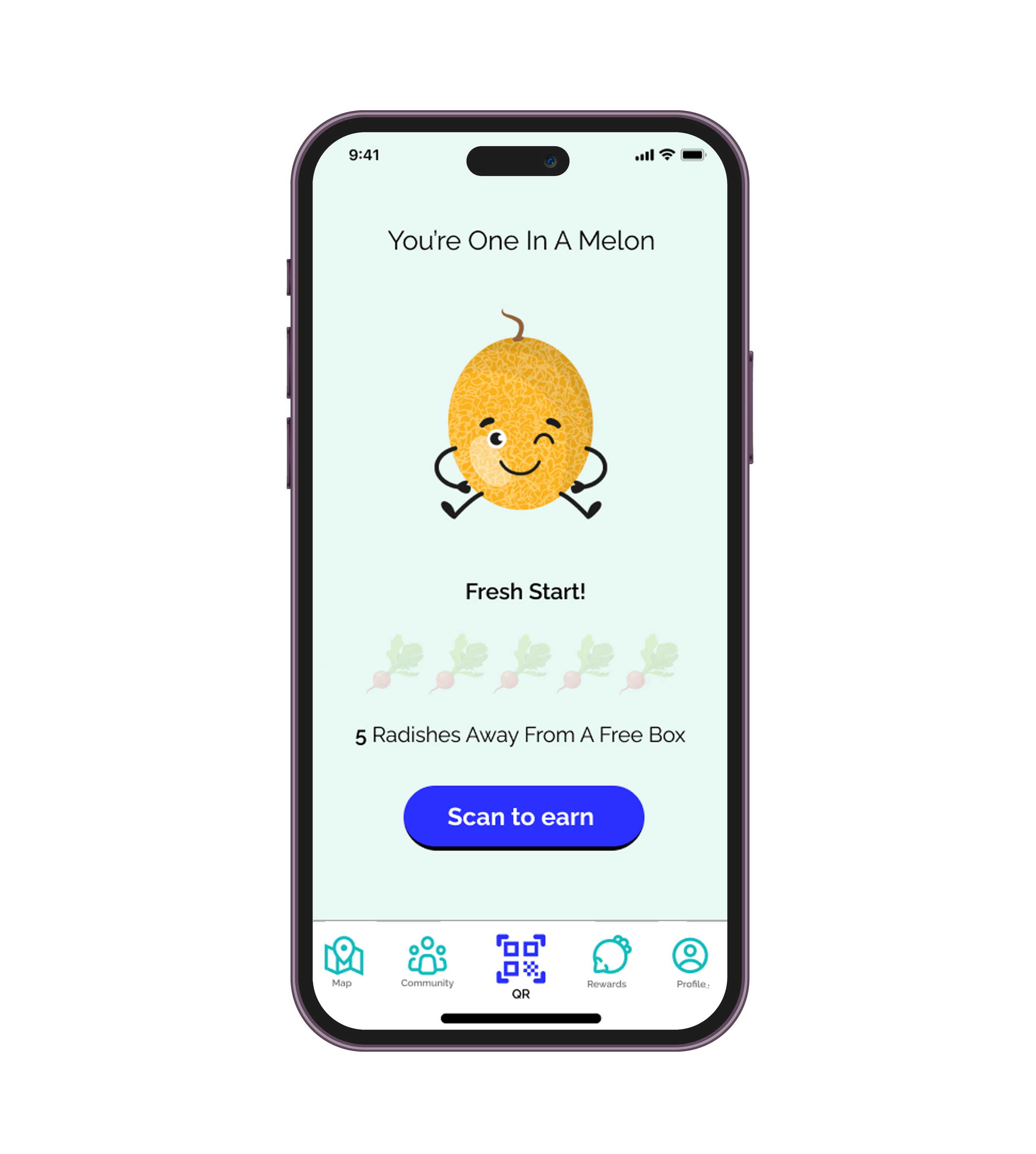
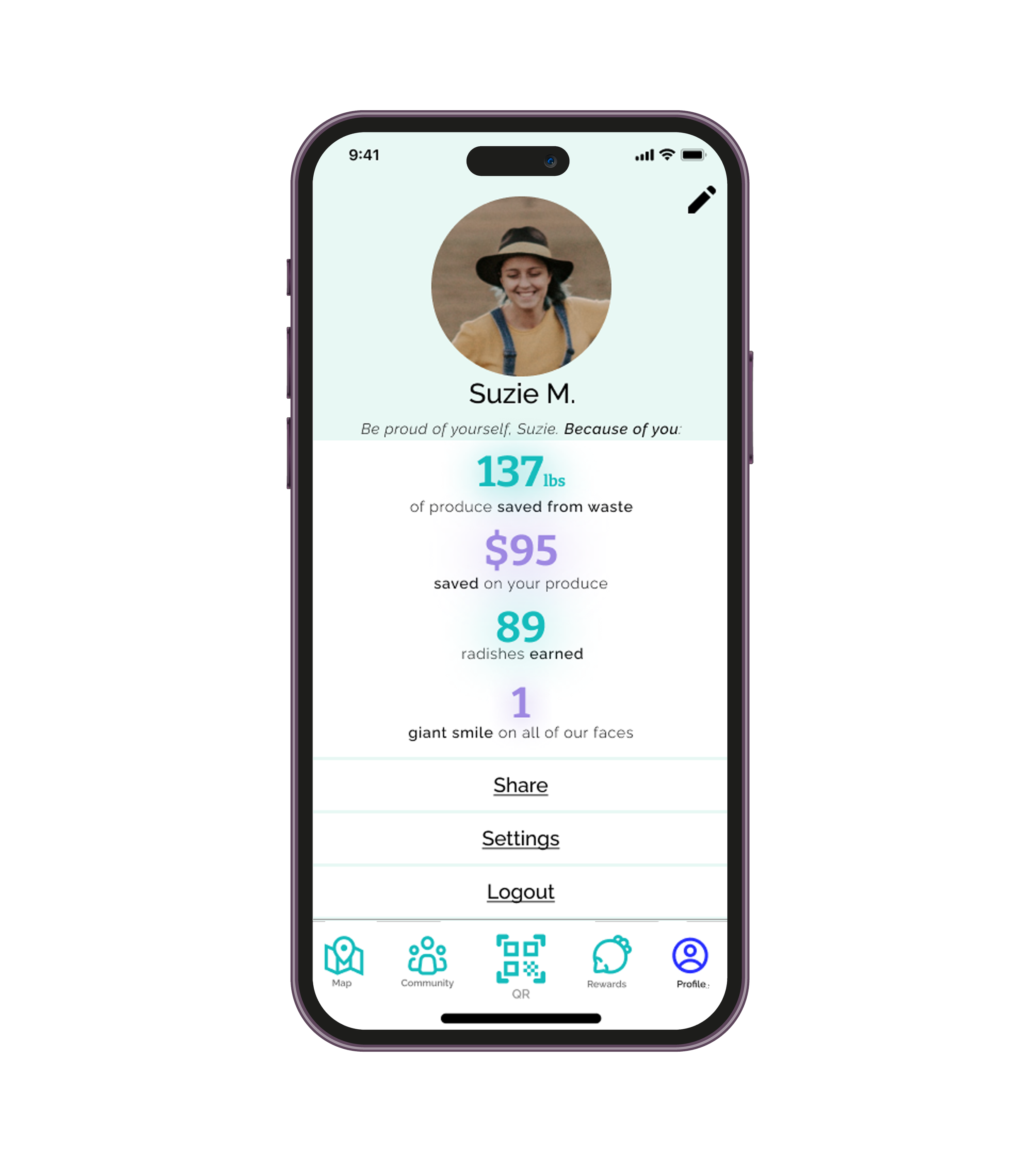
After a collaborative two-week effort in a design sprint project, my teammates and I have successfully designed this delightful app that beautifully integrate practicality with enjoyment. Now that we share a clear understanding of our goal, target users, and concepts behind this, let us take a look at how it all came together.
DESIGN DECISIONS
Rationale behind our design elements
Here is an overview of some of the design decisions our team collectively made for the product we were creating:
1. “Grapeful”
As a team, we chose the name “Grapeful” for our app as a playful blend between “Grape” to signify fruits and vegetables/produce, and “Grateful” to promote a positive and impactful user experience, aligning with our focus on community impact.
2. Joyful/Playful Mood
We’ve curated a joyful, playful ambiance in our app with vibrant vegetable illustrations and cheerful, friendly colors. Our goal is to make users feel welcomed, excited to use the app, and ultimately provide them with a delightful user experience.
3. Produce Puns
While exploring the prototype, users will discover numerous produce-related puns. These are strategically placed to enlighten the mood of our consumers, elicit some laughter, and create and enjoyable and pleasant app experience.
4. “Success” pages
The Confirmation/Success pages are elements that serve as motivation tools, inspiring users in their efforts to consume imperfect produce, and thus encouraging them on their journey towards reducing food waste.
USER TESTING
Key Findings
Upon completion of our prototype, my team and I conducted qualitative user testing with five participants remotely. The goal of this test was to observe how users interacted with the app within a designated scenario. Specifically, we asked participants to imagine themselves at a grocery store, seeking to redeem points for having purchased imperfect produce, and then queried them on how they would navigate through the app to accomplish this task.
The testing sessions were recorded for analysis, and afterward, participants were asked to provided feedback through a series of questions. Presented below is a summary of our findings:
Aesthetic
Users expressed a strong affinity for the app’s aesthetic and overall user experience. In areas where performance lacked, the joyful nature of the brand kept a smile on the user’s face.
KEY LEARNINGS
Function
Every user who participated in testing expressed their intent to use the app if it were to be developed. They mostly liked the usability of the app and the overall look and feel.
Layout
We identified design elements within the layout that received mixed feedback from users:
The login process
The size of barcodes
To improve user experience, we implemented facial recognition login and increased the size of the barcodes, in response to users’ feedback.
Lessons learned from the project
Among the realizations I had while working on this project are the complexity and extensive scale of the Food Waste issue. The research my teammates and I came up with shed some light on the staggering statistics of food wasted annually, especially in North America. Prior to this, I was fairly ignorant about the extent of our society’s food wastage, especially considering the challenges of food scarcity in some other parts of the world.
One other important element I learned is that people are receptive to actively participating in efforts aimed at reducing food waste, if equipped with the appropriate tools and knowledge. Furthermore, I discovered that people are willing to make efforts to change their habits and routines in order to minimize food waste, if such changes are both convenient and advantageous. Thus, this project demonstrates that informed consumer choices and convenient solutions have the potential for impactful change.


